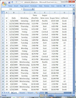
I saved the file as amazon_detail.xlsx, quit Excel, opened Tableau 7.0, and connected to the spreadsheet (because the data set is not large, I imported all of it into Tableau, instead of “connecting live”).
Tableau makes each non-numeric column a “Dimension”, and each numeric column a “Measure”. Additionally it includes a “record count” as a measure:
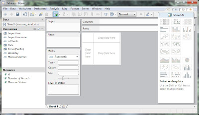
This first graph shows the Date and Number of Records selected, and Date is expanded down to Month:
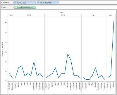
Horizontal lines can be added, but the software automatically groups the records by date, displays each month (spelled out), and generates this very elegant graph in only a couple of mouse-clicks. We can “overlay years”, but the data is probably too small to get much value from it – that type of analysis would be used to compare September Sales in one year against September Sales in the other years.
A more-useful graph is one showing distribution of sales-by-product – I sold an audiobook, and a few VHS tapes, but all the rest are split almost evenly between books and cds:

Adding Date to the Columns gives us Product Distribution for each year:

(I could do Quarterly, or even Monthly breakdowns, but I am just looking at the Big Picture for right now.) You can see that an audiobook was sold in 2010, and the VHS tapes were sold in 2010 and 2011; cd sales were zero in 2008 and 2011, but look to be the big movers in 2012; and while book sales seem relatively steady, not much is happening in 2012. Note that each graph goes out to the ~43 level, allowing for easy visual comparison between different bars in different years.
If we remove the Date field, and drag in the Weekday field, we can see how sales have occurred by weekday over the life-of-the-account:

Since the size of each weekday-box is the same, I can see that there does not seem to be much difference between weekend-versus-weekday sales, or early-in-the-week versus late-in-the-week. If you add Year(Date) as a dimension in the Columns, the data seems to get a little too fragmented for my liking.
I want to do some analysis using Time (what is the distribution of sales throughout 24 hours? is the distribution different for books than for cds?). Let’s view the data to see how Tableau handled the buyer time field:
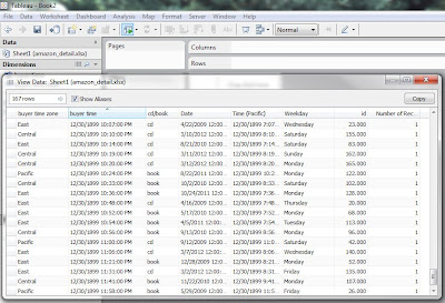
Tableau handled the buyer time field by bringing in each hour/minute/AM/PM, but assigned them all to 12/30/1899 (same for the Time (Pacific) field). After thinking about the data and analysis, I like it this way – I am currently only interested in what hour a client made a purchase. Using the Time (Pacific) field will tell me when I should do something (yesterday’s blog showed me when I should adjust my selling prices), and the buyer time field will tell me if cd-buyers are at different times of the day from book-buyers. To keep this blog from getting too long, I will go to the final graph: Number of Records in the Columns, Hour(buyer time) and cd/book in the Rows, Filtered for just cd or book, and Color by cd or book:
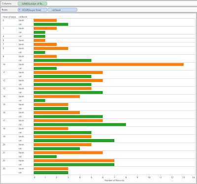
I see that books (orange) peak at 10 AM buyer time, while the cds (green) peak at 5 PM.Since I am expecting to move more cds in the future, this confirms yesterday’s price-adjustment-time of 4:30 PM.
No comments:
Post a Comment