In 2012, my wife and I have enjoyed the natural beauty around us here on Cape Ann and the North Shore of Boston. There are several organizations that manage beautiful properties, ranging from nationally-known (The Trustees of Reservations, Massachusetts Audubon Society) to local land banks (Manchester-Essex Conservation Trust). One favorite of mine is the Essex County Greenbelt Association: ECGA owns and manages over 5,000 acres of land and many miles of trails throughout Essex County, and has a great series of pushpins-on-Google-Maps: http://www.ecga.org/explore_and_engage/properties
When you click on a pushpin, you get a nice little infowindow:
I'm looking for a map, so I click Read More, and get the Property Description page:
There is an excellent pdf map of the Property:
But I want to see the map in interactive Google Maps. My first step is to trim the pdf:
My second step is to geo-reference the image - I need to get the latitude and longitude coordinates of the northeast (upper-right) and southwest (lower-left) corners of the image. I like using MapInfo within which I can get the latitude/longitude numbers for my cursor location. I have my own Google account and my own id for displaying Google Maps on my website (it is free). They have excellent documentation, and I can integrate an Overlay into Google Maps:
the map's url: http://www.dennisdixon.net/maps_EssexCountyGreenbelt/stoney_coveoriginal.htm
I modified the code to be able to toggle the Trail map on-and-off:
the improved map's url: http://www.dennisdixon.net/maps_EssexCountyGreenbelt/stoney_cove.htm
Monday, December 31, 2012
Friday, June 15, 2012
6/15/2012 Fun with GPS! (part 2)
I recently went on a hiking trip up Mount Washington (well, not all the way to the top, but up to Lakes of the Clouds), and I took my Data Logger. This is the track from Lakes of the Clouds back down to the parking lot (in the @trip software):
 It’s nice, but I’m looking for a little more WOW-factor. Let’s see if we can get this into Google Earth!
Well, it just so happens that there is a “View in Google Earth” button in the @trip software:
 Click it, and the file is exported into Google Earth:
 Let’s move around in Google Earth:

 It is great swooping around, and you get a real sense of the mountain. I put together a tour.You can download my original kmz file, as well as the tour:
LakesOfTheClouds.kmz
download file
LakesOfTheClouds_tour.kmz
download tour
 It’s nice, but I’m looking for a little more WOW-factor. Let’s see if we can get this into Google Earth!
Well, it just so happens that there is a “View in Google Earth” button in the @trip software:
 Click it, and the file is exported into Google Earth:
 Let’s move around in Google Earth:

 It is great swooping around, and you get a real sense of the mountain. I put together a tour.You can download my original kmz file, as well as the tour:
LakesOfTheClouds.kmz
download file
LakesOfTheClouds_tour.kmz
download tour
Saturday, June 9, 2012
6/9/2012 Fun with GPS! (part 1)
My wife and I enjoy walking/hiking around our beautiful Cape Ann, as well as kayaking on the lakes, inlets, harbors, and even “ocean” (although we do stay very close to shore to see the rocks). I have always wanted to get some type of GPS (Global Positioning System) unit that would allow me to show, on a map, where we go. Additionally, I really like “dancing the dance” – accomplishing 6 or 7 errands to 6 or 7 different locations as quickly and efficiently as possible (a library or two, dump, paper recycling, Post Office, CVS, grocery store, etc), and I would love to see my tracks on a map when I’m done.
Once upon a time I had an iPhone, and there was a great little app called Footsteps, but it used a lot of power from the iPhone, plus I traded it to my daughter last Christmas for her “not-smart” cell phone. Last week I read GPS for Dummies by Joel McNamara (2nd edition) – a very well-written book:
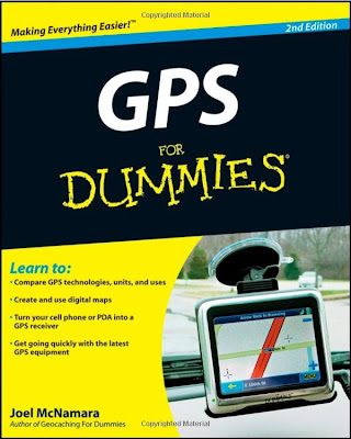 There are two ways to read this book: 1) starting at page one and going through to the end gives you great exposure to all aspects of GPS (to quote the Summary: An updated guide to the latest advances in GPS technology, devices, and applications provides step-by-step instructions on how GPS works, selecting and using GPS receivers, turning cell phones and PDAs into a GPS receiver, using digital maps, the game of geocaching, and other essential topics), or 2) figure out what you want to do and concentrate on that.
i-gotU GT-120 Travel Blog Master (USB GPS, Data Logger, SiRF III Chipset) – used $40.
 To give you an idea of the size, yes, that is a USB cable on the left! The gps unit fits in a circle you can make with your thumb and forefinger. To get up-and-running, load the mini-cd on your computer, and plug the unit into the USB cable, and plug the cable into your computer. This will charge the unit (couple of hours/overnight for first-time use).
First trip! I went down to White Beach, stood outside the car and pressed the button. “On” will display a little blue light, “Off” will display a little red light. I then put the unit on my dashboard, ran my errands, and turned it off when I got home. Plug it into the cable, and start the @trip PC software. A little Welcome window appears, which I like seeing:
 I click OK, and the software connects to their web site:
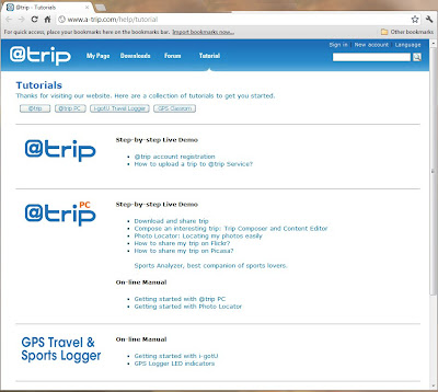 The software also detects the unit, and prompts you:
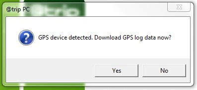 Click Yes, and the data is downloaded:
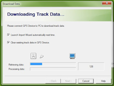 (One of the preferences I have is to clear the device after download)
The “Create Trip” window appears:
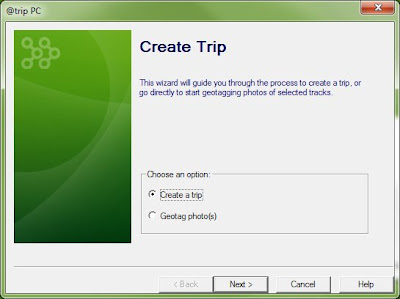 Click “Create a trip”, and click Next. You will be prompted to select a track (the one you just downloaded is selected by default)
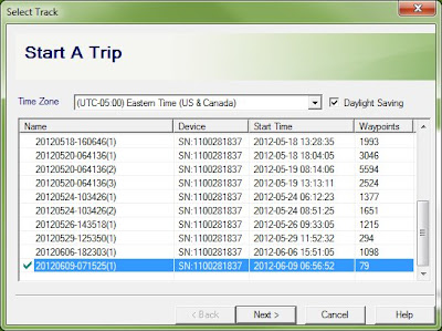 then click Next. You can then select a template for your map:
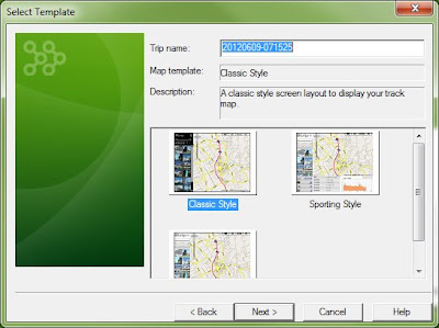 click Next. You can then add a photo to your map, if you like:
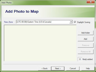 click Next. After processing the track data
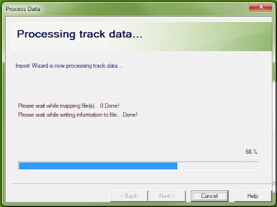 you get the Trip Completed window:
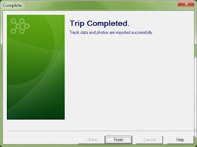 Click Finish.
You get a “clearing status” message;
 Then a Success message:
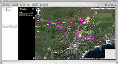
 Click OK, and the map is drawn!

 More tomorrow on getting your trip into Google Earth!
 There are two ways to read this book: 1) starting at page one and going through to the end gives you great exposure to all aspects of GPS (to quote the Summary: An updated guide to the latest advances in GPS technology, devices, and applications provides step-by-step instructions on how GPS works, selecting and using GPS receivers, turning cell phones and PDAs into a GPS receiver, using digital maps, the game of geocaching, and other essential topics), or 2) figure out what you want to do and concentrate on that.
i-gotU GT-120 Travel Blog Master (USB GPS, Data Logger, SiRF III Chipset) – used $40.
 To give you an idea of the size, yes, that is a USB cable on the left! The gps unit fits in a circle you can make with your thumb and forefinger. To get up-and-running, load the mini-cd on your computer, and plug the unit into the USB cable, and plug the cable into your computer. This will charge the unit (couple of hours/overnight for first-time use).
First trip! I went down to White Beach, stood outside the car and pressed the button. “On” will display a little blue light, “Off” will display a little red light. I then put the unit on my dashboard, ran my errands, and turned it off when I got home. Plug it into the cable, and start the @trip PC software. A little Welcome window appears, which I like seeing:
 I click OK, and the software connects to their web site:
 The software also detects the unit, and prompts you:
 Click Yes, and the data is downloaded:
 (One of the preferences I have is to clear the device after download)
The “Create Trip” window appears:
 Click “Create a trip”, and click Next. You will be prompted to select a track (the one you just downloaded is selected by default)
 then click Next. You can then select a template for your map:
 click Next. You can then add a photo to your map, if you like:
 click Next. After processing the track data
 you get the Trip Completed window:
 Click Finish.
You get a “clearing status” message;
 Then a Success message:
 Click OK, and the map is drawn!

 More tomorrow on getting your trip into Google Earth!
Saturday, April 28, 2012
4/28/2012 Empire of the Summer Moon
For Christmas 2011 my brother-in-law gave me a copy of Empire of the Summer Moon by S.C. Gwynne. It tells the story of the Comanches in the 1800’s. Centered in the southern Great Plains, from Kansas to northern Mexico, they were the most violent of the American Indian tribes. All of the stories and vignettes in this book relate to thoughts, actions, and words of actual individuals – out of these various threads, the fabric of our nation today is woven. There is only one map in the book - a very nice one in the beginning, by Jeffrey L. Ward.
The best way to read this book is in front of a computer, with Google Maps, Google Earth, and a search engine up and running. Empire … is the story about a particular place and time in our Nation’s history, and the geography is an integral part of the story – visualization of that geography helps to complete the story.
Chapter Nineteen – The Red River War
Page 275 … But the best reason to camp in the panhandle was that, in all the southern plains, there was no better place to hide. In the general vicinity of present-day Amarillo, the dead-flat Llano Estacado gave way to the rocky buttes and muscular upheavals of the caprock, where the elevation fell as much as a thousand feet. Into this giant escarpment the four major forks of the Red River had cut deep, tortuous canyons, creating some of the most dramatic landscapes in the American West. The spectacular Palo Duro Canyon, carved out over the geological aeons by the Prairie Dog Town Fork of the Red River, was a thousand feet deep, one hundred twenty miles long, between a half-mile and twenty miles wide, and crossed by innumerable breaks, washes, arroyos, and side canyons. This was long the Quahadis’ sanctuary. … … The final campaign took the form of five mounted columns designed to converge on the rivers and streams east of the caprock. Mackenzie commanded three of them: his own crack Fourth Cavalry was to march from Fort Concho (present-day San Angelo), and probe northward from his old supply camp on the Fresh Water Fork of the Brazos; Black Jack Davidson’s Tenth Cavalry would move due west from Fort Sill; and George Buell’s Eleventh Infantry would operate in a northwesterly direction between the two. From Fort Bascom in New Mexico, Major William Price would march east with the Eighth Cavalry, while Colonel Nelson A. Miles, a Mackenzie rival and a man destined to become one of the country’s most famous Indian fighters, came south with the Sixth Cavalry and Fifth Infantry from Fort Dodge, Kansas. I have two monitors, and I like working with the additional real estate (as opposed to an iPad or Kindle). I don’t think that I want to see a movie – but these additional interactive visualization tools make “reading” a richer experience.
Wednesday, April 18, 2012
4/18/2012 English Counts
With all the talk about data, and statistical ranges, and visualizations, and projections, let us never forget that yes, English counts. This map appeared in USA Today on April 13,2012:

It is a wonderful map. The projection allows for minimal distortion of “the lower 48”. The color range is evocative of dryness and drought. The five colors (plus white) are easily discernible. I don’t know the underlying data distribution, but the map agrees with my prejudices about the distribution of usual weather conditions in the US in the springtime.
My only complaint are with the words used to describe the data ranges. “No drought” is good for the first range, and “Abnormally dry” and “Moderate” are fine for the next two, although I don’t really have much of a sense as to whether “Moderate” is drier than “Abnormally dry”, or not. I must take issue with naming the three driest ranges: “Severe”, “Extreme”, and “Exceptional”. I have no idea (without being told in this graphic) if “Exceptional” is drier than “Severe”, or that “Extreme” is not as bad as “Exceptional”. English counts, and the words that you use to describe your data must communicate the relative level of the variable that you are measuring. Five phrases might be “Best”, “Good”, “Middle”, Bad”, and “Worst”. Another effective method would be to include numbers in the descriptions: “5-year Drought”, “10-year Drought”, “20-year Drought”, “50-year Drought”, and “100-year Drought”. There are many phrases you can use to describe data, but please be careful – I find it a bit distressing if you want me to figure out that “Exceptional” is worse than “Extreme”.
Tuesday, April 17, 2012
4/17/2012 When to use a logarithmic scale
When graphing data, most of the data we encounter is relatively-closely valued – temperature, people’s weight, SAT scores, Social Security payments. Once in a while, however, you encounter data that has a very wide range – people’s income, and home values. I am graphing buildings in Manchester-by-the-Sea – the date built versus the assessed value.
The “regular” graph uses linear scales for both the horizontal axis (Date Built) and the vertical axis (Assessed Value). In a linear scale the change-in-values are constant- there is the same change in the same distance at each end of the graph, both horizontally (20 years between each tick mark) and vertically ($2M between each tick mark).

For the dates on the graph, this works fine – I can see that the older buildings in town account for a smaller and smaller percentage as the years go by. Unfortunately, because there are a number of high-value buildings in the database (and I have removed three data points [$26m, $20m, and $15m] from this database), those buildings valued at less than $2,000,000 seem to be all bunched together. It is appropriate to “stretch” the Value scale – this is done by making it a logarithmic scale.
In a logarithmic scale the change-in-values are not constant- there are different changes in the same distance at each end of the graph. The rate-of-change is actually Base 10 (or “an order of magnitude”, or “moving the decimal point”). This is seen in the vertical axis – the distance from $100,000 to $1,000,000 is the same as from $1,000,000 to $10,000,000.

Using a logarithmic scale has the effect of “spreading apart” the values, and you can get a much better sense of that clump of houses that were built between 1945 and 1982, and are valued between $300,000 and $900,000

The point of this exercise is not to find “the correct way” of doing something, but to discover new tools that allow you greater insight into your data.
The “regular” graph uses linear scales for both the horizontal axis (Date Built) and the vertical axis (Assessed Value). In a linear scale the change-in-values are constant- there is the same change in the same distance at each end of the graph, both horizontally (20 years between each tick mark) and vertically ($2M between each tick mark).

For the dates on the graph, this works fine – I can see that the older buildings in town account for a smaller and smaller percentage as the years go by. Unfortunately, because there are a number of high-value buildings in the database (and I have removed three data points [$26m, $20m, and $15m] from this database), those buildings valued at less than $2,000,000 seem to be all bunched together. It is appropriate to “stretch” the Value scale – this is done by making it a logarithmic scale.
In a logarithmic scale the change-in-values are not constant- there are different changes in the same distance at each end of the graph. The rate-of-change is actually Base 10 (or “an order of magnitude”, or “moving the decimal point”). This is seen in the vertical axis – the distance from $100,000 to $1,000,000 is the same as from $1,000,000 to $10,000,000.

Using a logarithmic scale has the effect of “spreading apart” the values, and you can get a much better sense of that clump of houses that were built between 1945 and 1982, and are valued between $300,000 and $900,000

The point of this exercise is not to find “the correct way” of doing something, but to discover new tools that allow you greater insight into your data.
Saturday, March 31, 2012
3/31/2012 Flying through Essex County beaches
In reviewing my blog entries, on 5/23/2011 I wrote about “Mapping the beaches of Essex County”. It was a good start – I was able to research and discover the beaches and their coordinates, and then display them on Google Maps. That post stopped with a random path through the points, in a herky-jerky fashion, without beach names.
I have been teaching about Google Earth at a number of regional libraries, so I want to investigate making a “Google Earth tour” of the North Shore beaches.
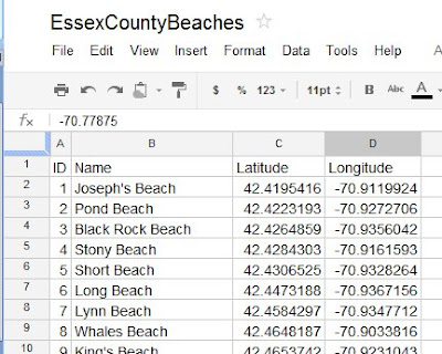
The first aspect of any process is “get the data”. I did this a year ago with the construction of the EssexCountyBeaches spreadsheet in Google Docs.
The second aspect of the process is “get the data into the program”. I was hoping to just import the data into Google Earth, but that fuctionality is only available in the Google Earth Pro version (which costs $399 per user per year). Of course there are a number of other features, but let’s stick with the free version for now.
Open the EssexCountyBeaches spreadsheet in Google Docs:
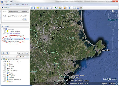
Open Google Earth (I have set Essex County, Massachusetts as my Starting Location). Go to Add > Folder, and call it Essex County beaches. It will appear in your list of My Places:
Since we want to start our tour at the “Essex County overview”, go to Add > Placemark. Call it Essex County, and click OK. It now appears in your “Essex County beaches” folder:

Let’s go to the first beach (Joseph’s Beach in Nahant). Copy the latitude from the spreadsheet into the Fly To box in Google Earth

Then type a comma in the Fly To box, then copy the longitude from the spreadsheet into the Fly To box in Google Earth, then click the fly to/begin search button. Google Earth flys you to the beach:
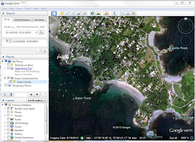
Go to Add > Placemark, Name it “Joseph’s Beach”, and click OK. It now appears in your “Essex County beaches” folder:

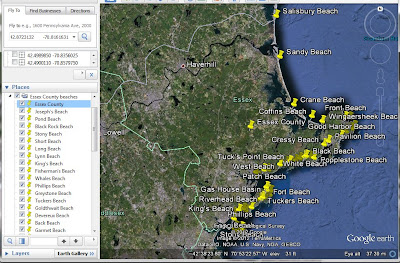
Repeat the process for the other 48 beaches. Once in a while you will back-track. When that happens, continue and get the Placemark into your list, then just click on it in the list and move it up. When you are finished, double-click on “Essex County” in the Essex County beaches folder, and get taken to an overview:
To make a Tour, click on Add > Tour, and the record icon apears in the lower-left corner of the map:

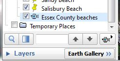
Click the red dot to start, then double-click the first beach (Joseph’s Beach). After you zoom-in, pause, then double-click the next beach. Continue until you finish, then click the red dot to stop. When the tour plays, click the Save icon, and name it “Essex County beaches”. The tour now appears at the bottom of the list in the Essex County beaches folder. The Play Tour icon has a picture of a movie camera – click it to play the tour.
Click on this link to download the zip file containing Google Earth places and tour
download the zip file
Unzip the file, and then open the kmz file in Google Earth. Have Fun!
I have been teaching about Google Earth at a number of regional libraries, so I want to investigate making a “Google Earth tour” of the North Shore beaches.
The first aspect of any process is “get the data”. I did this a year ago with the construction of the EssexCountyBeaches spreadsheet in Google Docs.
The second aspect of the process is “get the data into the program”. I was hoping to just import the data into Google Earth, but that fuctionality is only available in the Google Earth Pro version (which costs $399 per user per year). Of course there are a number of other features, but let’s stick with the free version for now.
Open the EssexCountyBeaches spreadsheet in Google Docs:

Open Google Earth (I have set Essex County, Massachusetts as my Starting Location). Go to Add > Folder, and call it Essex County beaches. It will appear in your list of My Places:

Since we want to start our tour at the “Essex County overview”, go to Add > Placemark. Call it Essex County, and click OK. It now appears in your “Essex County beaches” folder:

Let’s go to the first beach (Joseph’s Beach in Nahant). Copy the latitude from the spreadsheet into the Fly To box in Google Earth

Then type a comma in the Fly To box, then copy the longitude from the spreadsheet into the Fly To box in Google Earth, then click the fly to/begin search button. Google Earth flys you to the beach:

Go to Add > Placemark, Name it “Joseph’s Beach”, and click OK. It now appears in your “Essex County beaches” folder:

Repeat the process for the other 48 beaches. Once in a while you will back-track. When that happens, continue and get the Placemark into your list, then just click on it in the list and move it up. When you are finished, double-click on “Essex County” in the Essex County beaches folder, and get taken to an overview:

To make a Tour, click on Add > Tour, and the record icon apears in the lower-left corner of the map:

Click the red dot to start, then double-click the first beach (Joseph’s Beach). After you zoom-in, pause, then double-click the next beach. Continue until you finish, then click the red dot to stop. When the tour plays, click the Save icon, and name it “Essex County beaches”. The tour now appears at the bottom of the list in the Essex County beaches folder. The Play Tour icon has a picture of a movie camera – click it to play the tour.

Click on this link to download the zip file containing Google Earth places and tour
download the zip file
Unzip the file, and then open the kmz file in Google Earth. Have Fun!
Wednesday, March 28, 2012
3/28/2012 Springsteen Tour 2012
My daughters gave me a great birthday present: a ticket to Bruce Springsteen at the TD Garden in Boston two nights ago. I've been a fan for a long time (saw him with Jackson Browne at the Villanova Field House in October 1973), and this show was just GREAT!
The next day I hit Tour infomation on backstreets.com click for link and wanted to make maps of his USA and Europe tour legs. Starting with Excel, I made two spreadsheets - one for the USA

and one for Europe

I want to use Tableau for visualization; it has a nice little geocoding database (ZIP Codes, City Names, etc), so I only had to find latiutude-longitude for a few cities. Europe, on the other hand, needed latitude-longitude populated directly into the spreadsheet, so I consulted a misc. site on the Internet.
After bringing the files into Tableau, I ran the data in a time-series, which shows Bruce jumping all over the country (as the little red dotted lines indicate)(March 9 - May 2)

But that is nothing compared to the chicken scratches that makes up his European tour (May 13 - July 31):

Thanks, Bruce, for all the memories, and for keeping it alive.
The next day I hit Tour infomation on backstreets.com click for link and wanted to make maps of his USA and Europe tour legs. Starting with Excel, I made two spreadsheets - one for the USA

and one for Europe

I want to use Tableau for visualization; it has a nice little geocoding database (ZIP Codes, City Names, etc), so I only had to find latiutude-longitude for a few cities. Europe, on the other hand, needed latitude-longitude populated directly into the spreadsheet, so I consulted a misc. site on the Internet.
After bringing the files into Tableau, I ran the data in a time-series, which shows Bruce jumping all over the country (as the little red dotted lines indicate)(March 9 - May 2)

But that is nothing compared to the chicken scratches that makes up his European tour (May 13 - July 31):

Thanks, Bruce, for all the memories, and for keeping it alive.
Subscribe to:
Comments (Atom)


