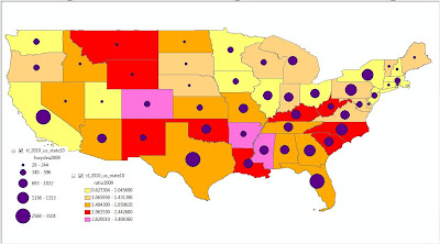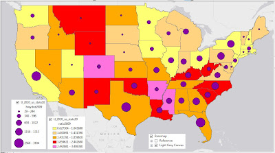
“Projection” refers to how the three-dimensional data (our real-world coordinate system on our real-world globe) gets “projected” onto a flat piece of paper (or, in this case, a flat computer screen). I only worry about projections in two circumstances: 1) when the map “doesn’t look right” and 2) when historical boundary files do not line up with current boundary files.
First things first – the top map was created straight from the TIGER 2010 boundary files downloaded from the U.S. Census Bureau, and those files use GCS_North_American_1983 for their Geographic Coordinate System. The nice map below, however, was started by using a basemap from ArcGIS Online – the Light Gray Canvas, which has GCS_WGS_1984 for their Geographic Coordinate System.

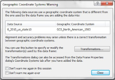
By starting with a layer that has a nice projection (GCS_WGS_1984, in this case), ArcMap will overlay any additional geographic data files (after giving you an appropriate Warning):

The second case of projection problems happens when your data suppliers change their data-delivery projection. This happened to me in the mid-1990’s – prior to 1995, TIGER files used the North American Datum of 1927 (NAD27). Beginning in 1995 (and continuing through today), the TIGER files are referenced to the North American Datum of 1983 (NAD83); as a result, historical boundaries no longer lined up, and an entire set of Mapping Data had to be created anew (streets, Census Tract boundaries, Block Groups, Counties, Water, etc.).
In summary, if it looks good, you are fine. But if it looks bad, investigate your projection(s).
No comments:
Post a Comment