Tuesday, March 20, 2012

3/20/2012 Business Intelligence 103

I am curious about the geographic distribution of my sales, so I added two columns to my original spreadsheet: ZIP and state. After populating them (in Excel) and saving, I refreshed the file link in Tableau, and the two new columns were successfully brought in as new Dimensions:

If you drag the ZIP dimension over onto the lower-right “Drop field here” box, the program will automatically calculate the correct latitude and longitude.

The results are displayed on a map:

I then filtered for just cds or books, and filtered for the lower 48 states. I then colored based on cd/book:

Without running spatial statistics, it looks like both products are equally distributed throughout the United States.

Tableau has a wonderful “Time series” feature. Populate the Pages section with the Date dimension (twice: one for Year, and then one for Month-within-Year). Since we are dealing with less than 200 points, I want to Show All Marks and uncheck Fade:

The animation cannot be shown in this blog, unfortunately, so you have to take my word that there is no apparent temporal factor that is meaningful.

Make another map, but instead of ZIP, use state. I filtered on just the lower 48, and cd or book. I changed the Marks from Automatic to Pie, and color the slices by cd/book. increase the size of the Pies, and you get a very nice map of Sales by State showing distribution between cds and books:

Since I am familiar with the population distribution of the United States, my sales seem to mirror that population density. And the split between cds and books appear to be close to equal, with various random deviations. Well, at least I have a good understanding of my data, even though I do not have any actionable information.

Wednesday, March 14, 2012

3/14/2012 Business Intelligence 102

This posting will show, and discuss, amazon.com sales data using Tableau for business intelligence analytics. Working from the same amazon.com sales data set discussed yesterday, I constructed a spreadsheet with seven columns: id, Date, Weekday, Time (Pacific), buyer time zone, buyer time, and cd/book:
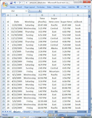

I saved the file as amazon_detail.xlsx, quit Excel, opened Tableau 7.0, and connected to the spreadsheet (because the data set is not large, I imported all of it into Tableau, instead of “connecting live”).

Tableau makes each non-numeric column a “Dimension”, and each numeric column a “Measure”. Additionally it includes a “record count” as a measure:
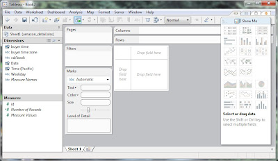
This first graph shows the Date and Number of Records selected, and Date is expanded down to Month:
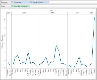
Horizontal lines can be added, but the software automatically groups the records by date, displays each month (spelled out), and generates this very elegant graph in only a couple of mouse-clicks. We can “overlay years”, but the data is probably too small to get much value from it – that type of analysis would be used to compare September Sales in one year against September Sales in the other years.

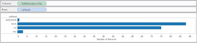
A more-useful graph is one showing distribution of sales-by-product – I sold an audiobook, and a few VHS tapes, but all the rest are split almost evenly between books and cds:
Adding Date to the Columns gives us Product Distribution for each year:
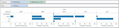
(I could do Quarterly, or even Monthly breakdowns, but I am just looking at the Big Picture for right now.) You can see that an audiobook was sold in 2010, and the VHS tapes were sold in 2010 and 2011; cd sales were zero in 2008 and 2011, but look to be the big movers in 2012; and while book sales seem relatively steady, not much is happening in 2012. Note that each graph goes out to the ~43 level, allowing for easy visual comparison between different bars in different years.

If we remove the Date field, and drag in the Weekday field, we can see how sales have occurred by weekday over the life-of-the-account:
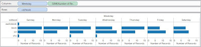
Since the size of each weekday-box is the same, I can see that there does not seem to be much difference between weekend-versus-weekday sales, or early-in-the-week versus late-in-the-week. If you add Year(Date) as a dimension in the Columns, the data seems to get a little too fragmented for my liking.
I want to do some analysis using Time (what is the distribution of sales throughout 24 hours? is the distribution different for books than for cds?). Let’s view the data to see how Tableau handled the buyer time field:
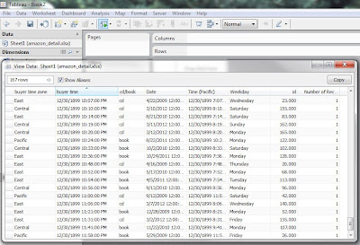
Tableau handled the buyer time field by bringing in each hour/minute/AM/PM, but assigned them all to 12/30/1899 (same for the Time (Pacific) field). After thinking about the data and analysis, I like it this way – I am currently only interested in what hour a client made a purchase. Using the Time (Pacific) field will tell me when I should do something (yesterday’s blog showed me when I should adjust my selling prices), and the buyer time field will tell me if cd-buyers are at different times of the day from book-buyers. To keep this blog from getting too long, I will go to the final graph: Number of Records in the Columns, Hour(buyer time) and cd/book in the Rows, Filtered for just cd or book, and Color by cd or book:
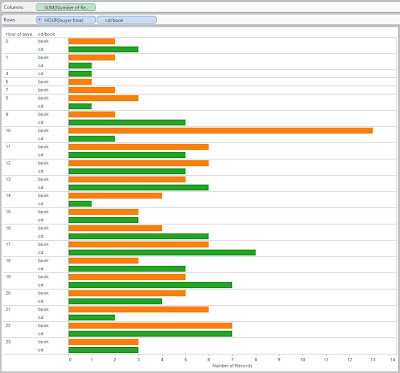
I see that books (orange) peak at 10 AM buyer time, while the cds (green) peak at 5 PM.Since I am expecting to move more cds in the future, this confirms yesterday’s price-adjustment-time of 4:30 PM.

Tuesday, March 13, 2012

3/13/2012 Business Intelligence 101

(perhaps this should be called Business Intelligence – the first steps)
Business Intelligence (or Business Analytics) is the process of analyzing data generated in the process of running a business. That analysis will, hopefully, result in information (“information” is data that is useful) that we can use to make better business decisions.

I have a Seller’s Account on amazon.com, and over the past 3 years, I have sold 167 items. [Note for any would-be Amazon Entrepreneurs – the price you sell at, plus the shipping & handling charge, minus Amazon’s cut, minus the actual cost of shipping comes out to about zero. The reason I do this is to get “my stuff” out of my house and into the hands of someone who actually wants it.] This is a sample of the information associated with my sales:


Since I believe that music collections are going to be digital (iTunes on your computer/tablet/cloud/phone, or wma files ripped to your Windows machine), the days of physical cds are soon to be over. [A personal note: when everyone had turntables and records in the late 60’s and early 70’s, I had a tape deck – I would buy an album for $3.25, record it, and then sell it to fellow students for $3.00 – a good deal for them, and a good deal for me. I could get 10 albums on a reel of tape, and no albums to lug around.] As a result, I have many cds for sale on amazon.com, and would like to know when is the best time of day to go into my account and adjust them to be the Low Price (because this is the way I purchase: if the quality is ok, I go for the Low Price).

Being in Massachusetts, I thought that a good time to adjust prices would be either at noon (for the lunch crowd) or 6 PM (for the evening buying crowd). You can see that for each order, Amazon gives me the order date and order time (in Pacific time), along with the item details. For this project I am only interested in the time; additional analysis can certainly be done on day-of-the-week, as well as music cd-versus-book. Maybe I will throw all that data into Tableau for another blog.

I made two Excel spreadsheets. The first spreadsheet had 24 rows (one for each hour), 1 column specifying the hours, 12 columns filled-in for each Amazon page (15 entries per page), and 1 column summing the 12 detail columns. The data in the second spreadsheet is a direct link to the summary column in the first spreadsheet, and then I made a horizontal bar chart for each hour (now in Eastern Time because that is what I understand). As I populated each cell in the first spreadsheet, the bars grew on the right:


When all was done, the 167 orders had two peaks (Noon, and 5 PM), with secondary peaks at 8 PM, 1 PM and 11 PM. Since Amazon sells throughout the entire US, I should not be surprised that the data is much smoother then I anticipated – 11 PM on the East Coast is still only 8 PM in California. Without further analysis (day of the week? cd versus book? actual mailing address (therefore time zone) of the purchaser? amount of time Low Price holds?), and assuming that my Low Price will hold for a few hours, I am comfortable setting prices at 4:30 in the afternoon.

Thursday, March 1, 2012

3/1/2012 Locations on Google Maps, Part 2

As I said yesterday, I want to get “real” Google Maps in this blog, not just screenshots. Let's just see if the "link feature" can get to the htm code on Dixon Spatial Consulting...
Click here for DixonMap5
Ok, that just links to the map, but does not make the map appear in the blog. I googled "putting google maps in a blog", and four interesting links are

How-To: Putting Google Maps on Your Blog

Add a Google MAP to your Blog.

How to easily add interactive Google Maps to your Blogger posts

Embedding a map into a website or blog

Since the last is actually from the Support area of Google itself, it will probably be the best, but I am curious and will read them all. [...time passes ...]
Ok, it looks like there is not an easy way to do this. Well, there is an "easy way", but it does not deliver the functionality that I have when I code my own maps (multiple locations, specific icons and tool tips, etc) - work through Google Maps.

How does this look?

View Larger Map

Well, actually, it does not look too bad. You can see multiple points, zoom-in/zoom-out, change to satellite view/terrain view/and even Google Earth view with 3D buildings in downtown Boston! - I told Google Maps "Bank of America branches in Boston, MA".

It looks like I can get "my maps" into this blog, but it takes a little more "poking around under the hood" than I am currently comfortable with (Modify the Template Code, then ADD HTML/Javascript Gadget). Maybe at another time...

Wednesday, February 29, 2012

2/29/2012 Locations on Google Maps, Part 1

Ever since Google Maps started in 2005, users have wanted to display data on the maps. This data ranges from single points (locations of addresses or buildings that they want to visit), to multiple points (restaurants in an area, bank branches nearby), to polygons (color towns by recycling rate, shade census tracts by income level). I want to learn as much as I can along these areas – it looks like the Google Maps/Google Earth platforms are going to be with us for quite some time. Although there are a number of web sites that allow the display of various types of information, I want to “do it myself” and program my own maps. Google Maps makes this possible with free use of their Google Maps API (API stands for application programming interface, and allows a user to write their own code to generate Google Maps). As you can imagine, the code that was useful a few years ago is no longer valid (it has been “deprecated”, to user programmer-speak). The latest version is Google Maps JavaScript API V3 – and that is about as technical as I will get in this blog.

Five years ago I programmed Google Maps to display multiple points – I think these are branch locations for Bank of America from 2008

I had geocoded the addresses, and been able to include the longitude/latitude coordinates in a list:
function onLoad() {
if (GBrowserIsCompatible()) {
map = new GMap(document.getElementById("map"));
map.centerAndZoom(new GPoint(-71.0725,42.3308), 5);
addmarker(-71.13642,42.36013);
addmarker(-71.05263,42.35275);
addmarker(-71.03902,42.37128);
addmarker(-71.05625,42.35898);
addmarker(-71.14736,42.33747); …

Starting with a new account, and new code, I coded in 3 of the old points to see if it works – success!


I then coded in all 169 branches.


Unfortunately, I think these markers are unattractive. It used to be relatively easy to select another icon, but those days are gone. I created a smallreddot icon (in Paint Shop Pro) with a transparent background, and saved it to the Icons folder on my website. The Google Maps code to access that icon is
var image = 'http://dixonspatialconsulting.com/icons/smallreddot.png';
and then I have to specify
icon: image
for each position (I’m sure there are easier ways, but it is pretty brute force for now).

and then this is what it looks like when I use Bank of America’s logo:


Next Steps include
- get “real” Google Maps in this blog – the images above are only pictures
- generating smaller logos at larger geographies (I would like to see more differentiation between the logos above)
- work with Google Fusion Tables (as a database), allowing me to display FusionTablesLayer on a map. Queries can be made of the data, and rendering is performed on Google servers rather than within my user’ browsers, thereby increasing performance dramatically.

Friday, February 17, 2012

2/17/2012 Telephone Area Codes

I recently found myself dealing with Telephone Area Codes. “Area Codes” are levels of geography that have been defined by the telephone industry over the years, with new area codes being added (and old ones being adjusted) as a result of population and commercial growth. There are currently 281 Area Codes in the United States. They range from single-Area Code states [Alaska (907), District of Columbia (202), Delaware (302), Hawaii (808), Idaho (208), Maine (207), Montana (406), North Dakota (701), New Hampshire (603), Rhode Island (401), South Dakota (605), Vermont (802), and Wyoming (307)] to multiple-Area Code states [the largest being California (29), Florida (17), New York (14), and Texas (23)].

The purpose of dealing with Area Codes is that you would like to get insight into a customer (the demographics of the area associated with the customer), but the only data point you have is a telephone number. Although they began with a simple definition covering specific areas (New York City = 212, Chicago = 312, etc.) and evolved to nationwide seamless coverage, they have now become, in some regions, overlaid on top of each other (although Area Code 657 covers 10 cities in California, Area Code 714 also covers those 10 cities, plus an additional 64 cities). For those interested, Wikipedia has an excellent article on the North American Numbering Plan
http://en.wikipedia.org/wiki/North_American_Numbering_Plan

Note: although the Wikipedia article lists 323 Area Codes, it includes proposed Area Codes and overlays; I am using the USA Telephone Area Codes boundary file available from Esri (281 Area Codes):


And don’t get me started on Area Codes for cell phones! My understanding is that the area code is assigned at the location where the cell phone is purchased; but by their very nature, these are mobile devices. My only hope for “data integrity” (that the cell phone Area Code actually means a location) is that, in these economic times, less people are moving. It was reported in November 2011 that only 11.6% — 35 million people — changed residence from 2010 to 2011, the lowest rate since the Census Bureau began collecting the statistics in 1948. In the mid-1980s, more than 20% were moving each year.

Analysis

Analysis is relatively straightforward – identify the area you are interested in, and grab (if at the state-level), or roll-up, the demographic variables you want. Originally, I wanted to do something complicated, like California. But after getting my hands (very) dirty, I will focus instead on the 12 Area Codes in Connecticut, Massachusetts, and Rhode Island:


By definition, Area Codes 339, 351, 774, and 857 are overlays of 781, 978, 508, and 617, respectively, so demographics need to be calculated for 8 Area Codes. 401 is all of Rhode Island, so that is an “easy grab”.

Examining Boundary files, it is apparent that Area Codes in Connecticut and Massachusetts are defined by Census Subdivision (“Cities and Towns”), and not Counties. The County Subdivision files for TIGER2010 can be downloaded from the Census Bureau’s ftp site:
ftp://ftp2.census.gov/geo/tiger/TIGER2010/COUSUB/2010/

From the Census Bureau web site, download Report DP03 – Selected Economic Characteristics [2006-2010 American Community Survey 5-Year Estimates] for the County Subdivisions in Connecticut and Massachusetts. Of the 173 Census Subdivisions in Connecticut, 51 are in Area Code 203 (and the rest are in 860) (for the record, the 351 Massachusetts Subdivisions are distributed: 98 in Area Code 413, 112 in 508, 12 in 617, 50 in 781, and 79 in 978). There are dozens of variables that can be rolled-up, but the ones I like are

VC74
VC85
VC101
VC112
VC156
.
Count of Total Households
Median Household Income
Count of Total Families
Median Family Income
Percentage of Families and People whose Income in the past 12 months is Below the Poverty Level


State/
Area_Code
CT/203
CT/860
MA/413
MA/508
MA/617
MA/781
MA/978
RI/401

Total
Households
666,967
692,251
320,464
767,523
485,987
465,413
473,165
410,305
Median
Household
Income
$76,757
$67,850
$51,767
$67,416
$61,649
$79,943
$73,820
$54,902

Total
Families
450,477
461,176
200,102
518,507
245,397
311,787
324,795
285,572
Median
Family
Income
$95,507
$82,703
$66,018
$82,875
$77,900
$99,032
$90,383
$70,663
Percent
Below
Poverty
6.7%
6.2%
10.6%
6.4%
11.5%
5.1%
6.3%
8.4%


These numbers illustrate that there are very wide ranges in income levels and poverty levels between Area Codes, even here in relatively-homogeneous Southern New England. I look forward to completing this analysis for the rest of the United States.

Friday, December 16, 2011

12/16/2011 Using Orthophotos

I recently purchased a data set of parcels, streets, elevation contours, and building footprints (shapefiles) for Manchester-by-the-Sea, Mass. The 2,366 parcels look GREAT!

I want them to be transparent, with a nice basemap showing through. When I started with Esri’s “Bing Maps Hybrid”, however, the features were not good enough – their Eaglehead Rd (light gray) does not really line up with the parcels/streets:

The map made with the Terrain basemap looks fun:

I was hoping for some type of satellite view. The type of photo is called an orthophoto. Any (initial) photo is taken through a single lens, and therefore what you see is an image coming together at a single focal point. In an orthophoto, the image has been corrected (“orthorectified”) so that each point on the photo appears as if you were directly above it (“ortho-“ is a word element meaning “straight”). Orthophotos are available from MassGIS (the Office of Geographic Information) http://www.mass.gov/mgis/colororthos2005.htm

By consulting their index, I downloaded the appropriate 6 zip files in Mr Sid format (“Contrast Stretched” looks best). After unzipping them, I opened them in ArcMap – it looks great!

The size of the orthophotos (1 file = 9.76 megs and covers an area 2.5 miles x 2.5 miles) make this impracticable for areas larger than a town or two, but for that level of analysis/display, they are a very nice layer. And you can’t beat the cost.