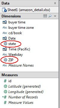
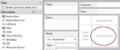
If you drag the ZIP dimension over onto the lower-right “Drop field here” box, the program will automatically calculate the correct latitude and longitude.
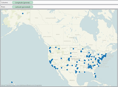
The results are displayed on a map:
I then filtered for just cds or books, and filtered for the lower 48 states. I then colored based on cd/book:
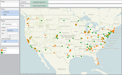
Without running spatial statistics, it looks like both products are equally distributed throughout the United States.
Tableau has a wonderful “Time series” feature. Populate the Pages section with the Date dimension (twice: one for Year, and then one for Month-within-Year). Since we are dealing with less than 200 points, I want to Show All Marks and uncheck Fade:
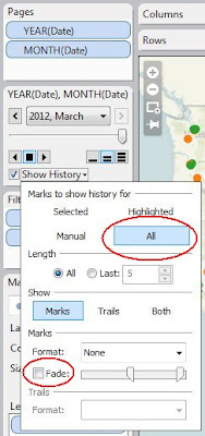
The animation cannot be shown in this blog, unfortunately, so you have to take my word that there is no apparent temporal factor that is meaningful.
Make another map, but instead of ZIP, use state. I filtered on just the lower 48, and cd or book. I changed the Marks from Automatic to Pie, and color the slices by cd/book. increase the size of the Pies, and you get a very nice map of Sales by State showing distribution between cds and books:
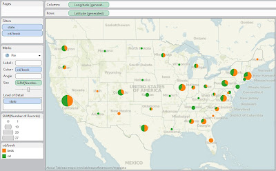
Since I am familiar with the population distribution of the United States, my sales seem to mirror that population density. And the split between cds and books appear to be close to equal, with various random deviations. Well, at least I have a good understanding of my data, even though I do not have any actionable information.
No comments:
Post a Comment