Thursday, December 8, 2011

12/8/2011 Traffic Cams, part 1 (too much NCIS?)

Maybe I’ve been watching too much NCIS, but when I was looking at the Maryland Department of Transportation website for Coordinated Highways Action Response Team (their Interactive Mapping page)
link to Interactive Mapping page

I was fascinated to see a link to Live Traffic Cameras (what is the traffic – out there/rightnow!)

Ouch – what a boring list, and totally unhelpful for someone not familiar with the area. It says “To view cameras from a map interface please use Interactive Mapping.”

So I went back to the Interactive Mapping page, and clicked the Video/Camera tab:

Living in the Boston area, I have a natural desire to look at, but not be involved in, traffic. Zoom-in on the area north of Washington, DC, and select the Video Camera at I-495 & River Rd (MD 190)

Up pops a web-window with a live feed:

And, yes, that is a url
http://www.chart.state.md.us/video/video.asp?feed=c600bd2b00070075004d823633235daa
Click on it, and you get your own live-link to "I-495 - RIVER N"!
If you work off the Interactive Map, the single pop-up window gets replaced for each camera you click on. But if you grab each url, you can have multiple windows open!
I-495 W OF MD-97
I-495 AT BRADLEY BLVD
MD-185 - MD-410 N

At the Northeast Arc Users Group Conference in Saratoga Springs, NY a few weeks ago, I saw a presentation populating the info boxes on Google Maps with pictures and urls. Which means that I should be able to have these video feeds just appear on the maps! Sounds like a great project for tomorrow’s blog.

Sunday, November 20, 2011

11/20/2011 Tornadoes!

I have recently become very interested in “GIS in Disaster Response”, and am investigating ways to serve our country in times of Disasters. Since more and more people are now living on a continually-unstable planet, “Disasters” are certainly not going to “just go away” – they happened in the past, they are happening now, and they will continue to occur in the future.

At a seminar I attended last week, one speaker spoke of his frustration at not having (geographic) information regarding “tornado damage” a few years ago in New Hampshire – the data had not been assembled, in one place, to allow the generation of $ damage estimates across multiple counties. (That situation has improved with the creation of the New Hampshire Mosaic Parcel Map)

This led me to think about a map showing tornadoes – their locations and their paths. Which led me to the Tornado History Project:

I selected Massachusetts (my home, but not a hotbed of tornado activity, or so I thought):

The map shows 152 tornados from 1951 through 2008, with 102 fatalities – nothing to make light of. At the bottom of the page, I click the link for the Storm Prediction Center’s (SPC) historical tornado data file, and get taken to the page where I can download csv files of Tornado/Hail/Damaging Wind:

This data page is a FABULOUS page! Scroll up, and there is a beautiful collection of heat maps, thematic maps, plot charts of tornado reports over time, small-multiple time series maps, monthly Summary Charts, and a map of Actual U.S. tornadoes for January through July, 2011:

Obviously I can not discuss all those visualization tools today – each will be a separate blog this coming week! But for today, I have discovered that, although each event is unique and tragic, tornadoes occur repeatedly over time, the historical data exist, and the visualization tools are already out there. From the data comes knowledge, and with knowledge we can prepare ourselves to respond when disasters (in this case, tornadoes) occur in the future.

Friday, November 18, 2011

11/18/2011 Are Maps Dangerous?

In the November 14-November 20, 2011 issue of Business Week, the article on the drug war in Mexico (“The Drug War in Mexico, Now on the Blogosphere”, page 45) states that “The editors at Nuevo Laredo en Vivo recently compiled [Twitter] reports to create a map of drug sale locations and suspected lookouts.”
article link
The map was published in a blog on September 25, 2011
blog link

It is good that the blog published this map, because it is now unavailable:
link to map page

I do not speak Spanish, and I have not contacted the website to ask why the map was taken down. All I do know is that “The site’s contributors included Maria Elizabeth Macias, the beheaded victim”. It seems that yes, maps are dangerous, and the results can be fatal.

Congressional Redistricting follow-up
Regarding my Nov 8, 2011 blog, there have been some updates/corrections. Unfortunately for Texas, on Sept 19 the U.S. Department of Justice said that their Congressional redistricting map does not comply with Section 5 of the Voting Rights Act, and a court challenge was filed on Sept 23. An excellent discussion of the Texas situation may be found here
blog link

In Arizona, on Tuesday Nov 1, the Chair of the Independent Redistricting Commission was impeached by Governor Jan Brewer and the Arizona Senate, because the Governor did not like the maps that the Commission was generating. Unfortunately for the Governor, on Thursday Nov 17, the Arizona Supreme Court reinstated Colleen Mathis as chair of the Commission, ruling that the impeachment was not lawful. This is fascinating, but a little like watching a train wreck in progress.

Further sources on redistricting:
Michael McDonald, a redistricting expert at George Mason University in Virginia
Jennifer Steen, Assistant Professor of Political Science, Arizona State University
Meredith McGehee, Project Director, Americans for Redistricting Reform
Keesha Gaskins, New York University’s Brennan Center for Justice

Tuesday, November 8, 2011

11/8/2011 new Congressional District maps

Changes following the 2010 census
On December 21, 2010 the U.S. Census Bureau released its official apportionment results for congressional representation. The changes will be in effect for the U.S. elections in 2012, provided no legal challenges to the results significantly change the results.
Gain four seats
Texas
Gain two seats
Florida
Gain one seat
ArizonaGeorgiaNevadaSouth CarolinaUtahWashington

Lose one seat
IllinoisIowaLouisianaMassachusettsMichiganMissouriNew JerseyPennsylvania

Lose two seats
New York
Ohio
link to wikipedia article

The lead story on today’s (Massachusetts) news was 1 – over 50 Massachusetts cities and towns have elections today (out of 351 cities and towns), and 2 – the new Congressional maps have been released, showing how Massachusetts went from ten Congressional Districts down to nine.

My gut sense has been that although the maps for the State House and Senate were released in late October (and Governor Patrick signed them Thursday, November 3, 2011), the new map for the nine Congressional Districts would be released “as late as possible” to avoid rancor/conflict/stalemate. I want to see if Massachusetts is “quick” on this process, “slow” on this process, or “somewhere in between”. It turns out that every state has its own specific timetable – for example, the Florida Legislature is specifically required to redistrict the State House and State Senate districts during the 2012 Legislative Session [Florida Constitution, Art III, s. 16 (a)], and their Congressional Redistricting Plan is scheduled for their Legislative approval between January 10 and March 9, 2012 (there are currently 152 publicly submitted Florida redistricting maps). For Massachusetts, the key restriction is that, according to the Massachusetts Constitution, “Every representative, for one year at least immediately preceding his election, shall have been an inhabitant of the district for which he is chosen” – since the next election for State Representatives is Tuesday, November 6, 2012, the map for the State House must be released before November 6, 2011 in order to allow for the “one year residency” restriction. I believe the sense of that restriction carries over to both the State Senate and Congressional District elections/maps. Glad to see that we are on track!

Well, we already know that Florida is nowhere near close to getting their “official” Congressional District map. What about some of the other states listed above? Note: any state, regardless of losing or gaining Congressional seats, can redraw Congressional District Boundaries (except the following states which only have one Congressional Representative: Alaska, Delaware, Montana, North Dakota, South Dakota, Vermont, and Wyoming).

The new map for Texas Congressional Districts (PLANC185) is currently available as a shapefile (Texas PLANC185). The creation data within the shapefile is June 15, 2011, although it looks like the actual legislative dates are:
June 22, 2011 signed in the State Senate
June 24, 2011 signed in the State House, and sent to the Governor
July 18, 2011 signed by the Governor

Although Arizona’s Independent Redistricting Commission has approved a Draft Congressional District map (Arizona Redistricting Map), the Commission only recently (Saturday, November 5, 2011) completed the 2nd round of public hearings. They still need to issue the “Final Map”. Note: after issuing their “Final Map”, all states must engage in the Department of Justice preclearance process before the maps are truly finalized. They seem to have no “official timetable”.

Saturday, November 5, 2011

11/5/2011 The Display of Information – Print and Online

There were news articles this week about the increase of poverty in the United States (The New York Times article link). The primary source is the report released by the Brookings Institute (“The Re-Emergence of Concentrated Poverty: Metropolitan Trends in the 2000s”, released Thursday, November 3, 2011). I am interested in these types of reports/articles for three reasons:
- as an American, I want to be aware of the ever-changing economic and demographic profiles of our society,
- as a person, I want to know how our society will deal with its problems, including poverty, and
- as someone who deals with data, I want to understand data, and understand and implement the most effective methods to transform that data into information.

The New York Times article

The online New York Times article consists only of text, plus four hyperlinks (“the report”, “The Truly Disadvantaged”, “Center on Poverty, Inequality and Public Policy”, and “earned income tax credit”) [the print version, of course, does not have even the hyperlinks]. Although there are mentions of geographic places (“Midwestern: Toledo and Youngstown in Ohio, and Detroit”, and “Sun Belt areas like Cape Coral, Fla., and Fresno, Calif.”), there are no accompanying maps or visualizations.

Just as it is important to discuss regional differences (Europe, Japan, North America, etc), and not just the entire “global economy”, an important part of the story of Concentrated Poverty in America is regional differences within the United States.

I went to the Brookings Institute website to both view their presentation of the Report, and to download the Report itself. Brookings link

The Brookings Institute Report

Before discussing the website, let’s look at the pdf Report. The 35-page report includes bar charts, number tables, a nationwide map, detail maps for Detroit, Dallas, Chicago, and Atlanta, appendices with the raw data, and two pages of endnotes.

The nationwide map shows colored dots (“circles that are all the same size”) over a map of the states. The dots are colored into four ranges, depending upon their “Concentrated Poverty Rate, 2005-09”. The colors are a good intuitive blue-color ramp (darker = more), but I would like to see the “count of areas” next to each colored dot in the legend:

15%< [24 areas] means there are 24 metropolitan areas with Concentrated Poverty Rates Greater Than 15%

As for the “circles that are all the same size”, welcome to “Displaying Data 101” – sometimes there is too much data to display on a single (static) map. In this case, because of the great number of metro areas in the Northeast, you can only see them all if they are relatively-small symbols (circles, squares, diamonds). Using different symbols for size variables could be used, but it might just make the map too busy.

Examining the map makes me wonder about applying Spatial Statistics to the data – examining each set of colored dots just gives me a “random” feeling, but that can certainly be validated through examining the Spatial Distribution of the data (and each data set). Another blog for another time.

The Brookings Institute online article

The Brookings online article is longer than the New York Times article (606 words versus 488 words), and includes the (linked) ability to “find concentrated poverty statistics for your metropolitan area”, plus a video. There are also two very nice maps of the 100 largest “metropolitan areas” in the United States. Although the maps are static (there is no slider to show changing data-over-time), the white non-outline of the light gray states provides the perfect background for the multivariate data.

Map 1 shows
- latitude/longitude location,
- size of circles equals current counts of people living in extreme-poverty census tracts, and
- color of circles indicates increase/decrease change from Census2000 data.

Additionally, the webpage takes advantage of the user interface, and offers the user a “hover over” ability – when you hover over a metro area, a detail popup appears with statistics relating to that metro area:


Map 2 shows
- latitude/longitude location,
- size of circles equals current level of Concentrated Poverty Rate, and
- color of circles indicates increase/decrease change from Census2000 data.

My next blog will discuss taking the data from the pdf Report into an Excel spreadsheet, then into Tableau Software for visualization over time.

Tuesday, October 4, 2011

10/4/2011 Sinkholes in Florida

I am in the process of purchasing a house in Spring Hill, Florida (Hernando County). In today’s discussion with the insurance company, they said “Well, of course, you need insurance for sinkholes.”

WHAT!!!!

Of course I have heard of sinkholes, but I thought they were very far-and-few-between – the stuff of headlines:

GERMANY - A giant sinkhole under a residential street opened up on Monday in central Germany. ...
GERMAN SINKHOLE link

GYPSUM (AP) - Sinkholes have been popping up near long-abandoned mines along a busy Lake Erie highway, and the state plans to fill in some of the tunnels before the holes reach the road. ...
Sinkholes near Gypsum prompt monitoring link

but, living here in relatively-geologically-stable New England, I think that “sinkhole insurance” is about as necessary as “elephant-through-your-living-room insurance”. But maybe Florida is different – let’s use our GIS resources and knowledge to investigate!

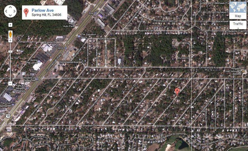
Because the tool is there, and so easy to use, let’s “Google Map” the house: 34606 Parlow Avenue, Spring Hill, FL:

And let’s zoom out to see the major highways on the east (589) and the west (19):


Also because it is easy to use, let’s Google “database of sinkholes”. Maybe Google knows I’m a GIS guy, or maybe I’m just lucky, but the first hit looks promising:

FGS, Sinkholes in Florida
webpage link

It is the Sinkholes page for the Florida Department of Environmental Protection – certainly a trustworthy source! Scroll down to the bottom, and in the Sinkhole Resources section, download and open Florida’s Sinkholes (Poster No. 11) Contact FGS to purchase this 24” by 36” poster


Depending on the size of your computer monitor, this is a pretty scary poster! Especially when you realize that Spring Hill is on the west coast just north of Tampa Bay! Let’s try to find some Good News.

First, though, what county is Spring Hill, Fl in? Wikipedia says that “Spring Hill is a census-designated place (CDP) in Hernando County, Florida”. We will see below that is a good assumption.

Back on the Sinkholes page, scroll down to the bottom, and in the Sinkhole Resources section, download and open Sinkhole type, Development and Distribution in Florida Map (Map Series 110). This is a beautiful thematic map of Florida, produced by the USGS in 1985, with soils divided into four areas related to sinkhole type:

Zoom in on Hernando County:


And we see that Hernando County has three-of-the-four areas:
Yellow is Area I – “Sinkholes are few, …”
Green is Area II – “… Sinkholes are few, …”
Blue is Area III – “… Sinkholes are most numerous, …”

So where is our property in Hernando County, in relation to these yellow/green/blue areas???

Open MapInfo, and open a County file, and open a Streets file, and zoom-in on Hernando County:


I have put a Gold Star in the area of the house. Comparing it with the USGS map, it looks like the house is in the green area under the “H” in “Hernando”. That’s Good News!

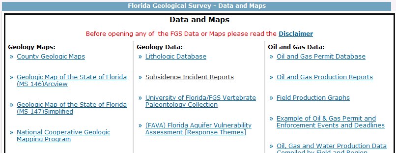
Maybe I should leave well enough alone/let sleeping dogs lie, but let’s see if there is a database of actual sinkhole locations. Back on the Sinkholes page, the left column has a Data & Maps link. Click it to get to the Data and Maps window:

By now, I realize that “sinkholes” are also referred to as “subsidence incidents”, which sounds much nicer. Click on the link for Subsidence Incident Reports to get to the Subsidence Incident Reports page:

Scroll down, and download the ESRI ArcGIS compatible shapefile. Unzip the file and bring it up in the MapInfo screen you worked on before:

Um, I don’t feel so happy anymore – there are sinkholes (“subsidence incidents”) all around the new house! Maybe the USGS should update its map/geologic database. Let’s make a copy of the sinkhole file (only County = “HERNANDO”, and only the oyear column [original reported year]), bring it up, and color the dots by oyear. This will allow us to see if the sinkholes happened back in the Sixties or Seventies, or if they are more recent:

Well, most happened in the 1990’s. Zoom-in on the house:

Using a radius tool, we see that the closest reported sinkhole is purple 0.4 miles to the west, and the closest red one is 0.6 miles to the northeast. I guess it is time to call the insurance company and get some “sinkhole insurance”.

Saturday, October 1, 2011

10/1/2011 Red Sox September Swoon

(As a tip-of-the-hat to my Florida relatives and friends, this column could be called The Rays Astounding Ascent)

On the morning of September 4, the Boston Red Sox, at 84-54, although ½ game behind the New York Yankees, were nine games ahead of the Tampa Bay Rays (75-63) in the Wild Card race. Over the following 24 days
- the Red Sox went 6-18 (winding up at 90-72),
- the Rays went 16-8 (winding up at 91-71),
- and the Rays are in the Playoffs.

I pulled the 2011 American League East daily results into a Google Docs spreadsheet, and added their Motion Charts gadget (see my 1/2/2011 blog). Because the beginning-of-April results were so wacky from a percentage standpoint (the Baltimore Orioles won their first four games, and the Boston Red Sox and the Tampa Bay Rays both lost their first six games), I decided to look at the results beginning May 1.

Information can come in many formats, so I decided to see “the Swoon” in motion. Right-click this link and "Open in a new window"
http://www.dixonspatialconsulting.com/HTMLredsox.htm [NOTE: users without the capability to right-click should open a new window, go to this blog, and just click the link in that new window]
Please follow instructions to modify the Chart that appears

Change the x-axis from percentage to Time

In the upper-right, change Same color to Unique colors, and check the boxes for Boston Red Sox, New York Yankees, and Tampa Bay Rays. Then click the Play button in the lower-left, and watch the season unfold:

If you change the x-axis to Order: Alphabetical, and uncheck Trails, you get a good vertical display of the season:

But I feel the most effective visualization (well, maybe not most effective, but most tragic) comes when you click on the Bars tab
, then click Play. For almost all of the season, the two left columns are swapped between the Yankees and the Red Sox – it is only on the Last Day that the Rays replace the Red Sox in second place:

Too bad for Boston, but congratulations to Tampa Bay!