On the morning of September 4, the Boston Red Sox, at 84-54, although ½ game behind the New York Yankees, were nine games ahead of the Tampa Bay Rays (75-63) in the Wild Card race. Over the following 24 days
- the Red Sox went 6-18 (winding up at 90-72),
- the Rays went 16-8 (winding up at 91-71),
- and the Rays are in the Playoffs.
I pulled the 2011 American League East daily results into a Google Docs spreadsheet, and added their Motion Charts gadget (see my 1/2/2011 blog). Because the beginning-of-April results were so wacky from a percentage standpoint (the Baltimore Orioles won their first four games, and the Boston Red Sox and the Tampa Bay Rays both lost their first six games), I decided to look at the results beginning May 1.
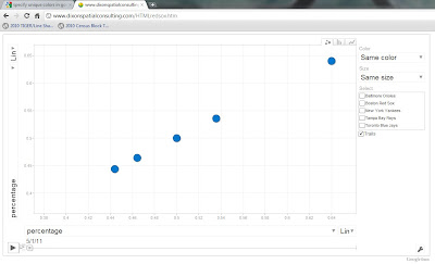
Information can come in many formats, so I decided to see “the Swoon” in motion. Right-click this link and "Open in a new window"
http://www.dixonspatialconsulting.com/HTMLredsox.htm [NOTE: users without the capability to right-click should open a new window, go to this blog, and just click the link in that new window]
Please follow instructions to modify the Chart that appears

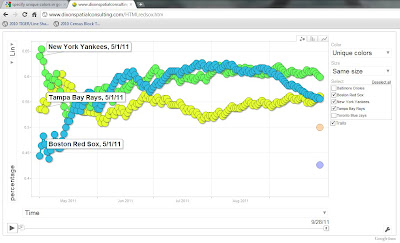
Change the x-axis from percentage to Time

In the upper-right, change Same color to Unique colors, and check the boxes for Boston Red Sox, New York Yankees, and Tampa Bay Rays. Then click the Play button in the lower-left, and watch the season unfold:

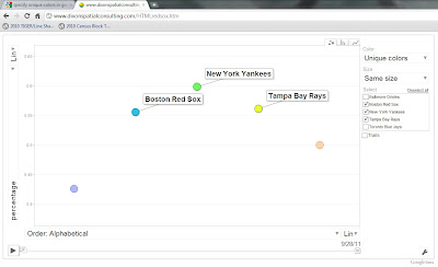
If you change the x-axis to Order: Alphabetical, and uncheck Trails, you get a good vertical display of the season:

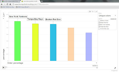
But I feel the most effective visualization (well, maybe not most effective, but most tragic) comes when you click on the Bars tab
 , then click Play. For almost all of the season, the two left columns are swapped between the Yankees and the Red Sox – it is only on the Last Day that the Rays replace the Red Sox in second place:
Too bad for Boston, but congratulations to Tampa Bay!
No comments:
Post a Comment