Tuesday, October 4, 2011

10/4/2011 Sinkholes in Florida

I am in the process of purchasing a house in Spring Hill, Florida (Hernando County). In today’s discussion with the insurance company, they said “Well, of course, you need insurance for sinkholes.”

WHAT!!!!

Of course I have heard of sinkholes, but I thought they were very far-and-few-between – the stuff of headlines:

GERMANY - A giant sinkhole under a residential street opened up on Monday in central Germany. ...
GERMAN SINKHOLE link

GYPSUM (AP) - Sinkholes have been popping up near long-abandoned mines along a busy Lake Erie highway, and the state plans to fill in some of the tunnels before the holes reach the road. ...
Sinkholes near Gypsum prompt monitoring link

but, living here in relatively-geologically-stable New England, I think that “sinkhole insurance” is about as necessary as “elephant-through-your-living-room insurance”. But maybe Florida is different – let’s use our GIS resources and knowledge to investigate!

Because the tool is there, and so easy to use, let’s “Google Map” the house: 34606 Parlow Avenue, Spring Hill, FL:
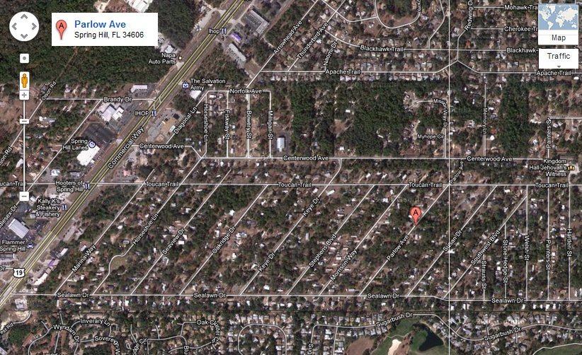
And let’s zoom out to see the major highways on the east (589) and the west (19):


Also because it is easy to use, let’s Google “database of sinkholes”. Maybe Google knows I’m a GIS guy, or maybe I’m just lucky, but the first hit looks promising:

FGS, Sinkholes in Florida
webpage link

It is the Sinkholes page for the Florida Department of Environmental Protection – certainly a trustworthy source! Scroll down to the bottom, and in the Sinkhole Resources section, download and open Florida’s Sinkholes (Poster No. 11) Contact FGS to purchase this 24” by 36” poster


Depending on the size of your computer monitor, this is a pretty scary poster! Especially when you realize that Spring Hill is on the west coast just north of Tampa Bay! Let’s try to find some Good News.

First, though, what county is Spring Hill, Fl in? Wikipedia says that “Spring Hill is a census-designated place (CDP) in Hernando County, Florida”. We will see below that is a good assumption.

Back on the Sinkholes page, scroll down to the bottom, and in the Sinkhole Resources section, download and open Sinkhole type, Development and Distribution in Florida Map (Map Series 110). This is a beautiful thematic map of Florida, produced by the USGS in 1985, with soils divided into four areas related to sinkhole type:

Zoom in on Hernando County:


And we see that Hernando County has three-of-the-four areas:
Yellow is Area I – “Sinkholes are few, …”
Green is Area II – “… Sinkholes are few, …”
Blue is Area III – “… Sinkholes are most numerous, …”

So where is our property in Hernando County, in relation to these yellow/green/blue areas???

Open MapInfo, and open a County file, and open a Streets file, and zoom-in on Hernando County:


I have put a Gold Star in the area of the house. Comparing it with the USGS map, it looks like the house is in the green area under the “H” in “Hernando”. That’s Good News!

Maybe I should leave well enough alone/let sleeping dogs lie, but let’s see if there is a database of actual sinkhole locations. Back on the Sinkholes page, the left column has a Data & Maps link. Click it to get to the Data and Maps window:
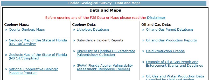
By now, I realize that “sinkholes” are also referred to as “subsidence incidents”, which sounds much nicer. Click on the link for Subsidence Incident Reports to get to the Subsidence Incident Reports page:

Scroll down, and download the ESRI ArcGIS compatible shapefile. Unzip the file and bring it up in the MapInfo screen you worked on before:

Um, I don’t feel so happy anymore – there are sinkholes (“subsidence incidents”) all around the new house! Maybe the USGS should update its map/geologic database. Let’s make a copy of the sinkhole file (only County = “HERNANDO”, and only the oyear column [original reported year]), bring it up, and color the dots by oyear. This will allow us to see if the sinkholes happened back in the Sixties or Seventies, or if they are more recent:

Well, most happened in the 1990’s. Zoom-in on the house:

Using a radius tool, we see that the closest reported sinkhole is purple 0.4 miles to the west, and the closest red one is 0.6 miles to the northeast. I guess it is time to call the insurance company and get some “sinkhole insurance”.

Saturday, October 1, 2011

10/1/2011 Red Sox September Swoon

(As a tip-of-the-hat to my Florida relatives and friends, this column could be called The Rays Astounding Ascent)

On the morning of September 4, the Boston Red Sox, at 84-54, although ½ game behind the New York Yankees, were nine games ahead of the Tampa Bay Rays (75-63) in the Wild Card race. Over the following 24 days
- the Red Sox went 6-18 (winding up at 90-72),
- the Rays went 16-8 (winding up at 91-71),
- and the Rays are in the Playoffs.

I pulled the 2011 American League East daily results into a Google Docs spreadsheet, and added their Motion Charts gadget (see my 1/2/2011 blog). Because the beginning-of-April results were so wacky from a percentage standpoint (the Baltimore Orioles won their first four games, and the Boston Red Sox and the Tampa Bay Rays both lost their first six games), I decided to look at the results beginning May 1.

Information can come in many formats, so I decided to see “the Swoon” in motion. Right-click this link and "Open in a new window"
http://www.dixonspatialconsulting.com/HTMLredsox.htm [NOTE: users without the capability to right-click should open a new window, go to this blog, and just click the link in that new window]
Please follow instructions to modify the Chart that appears

Change the x-axis from percentage to Time

In the upper-right, change Same color to Unique colors, and check the boxes for Boston Red Sox, New York Yankees, and Tampa Bay Rays. Then click the Play button in the lower-left, and watch the season unfold:

If you change the x-axis to Order: Alphabetical, and uncheck Trails, you get a good vertical display of the season:

But I feel the most effective visualization (well, maybe not most effective, but most tragic) comes when you click on the Bars tab
, then click Play. For almost all of the season, the two left columns are swapped between the Yankees and the Red Sox – it is only on the Last Day that the Rays replace the Red Sox in second place:

Too bad for Boston, but congratulations to Tampa Bay!

Friday, August 5, 2011

8/5/2011 FFIEC releases 2011 Geocoder


This week, the FFIEC announced the release of the 2011 version of its Geocoding/Mapping System. Accessed through a link from the FFIEC Main Page, the user inputs one address at a time - it is, therefore, only useful to spot-check individual geocodes generated by another batch geocode process, or to geocode a few addresses in areas outside of an individual's licensed region.

The System states that the tract definition for 2009, 2010, and 2011 data are based on the 2000 Census. Testing 2 address in Niantic, CT 06357 (20 Sleepy Hollow Rd and 20 Beckwith St), both geocode to Tract Code 7162.00. This (correctly) is the Tract generated for Census 2000 - the Census Tracts are different for the 2010 Census (8707.01 and 8707.04, respectively).

I have previously mentioned that there will be no MSA/MD changes until 2013, when the OMB will base their decisions on 2010 Census data. It is nice to confirm that the Regulatory Agencies are consistent (in staying with 2000 Census Tracts), so far.

Wednesday, June 22, 2011

6/22/2011 Maps Communicate Actionable Information

In his June 20, 2011 blog click here for blog, David Kroodsma references the Flood map and Drought map on the USGS WaterWatch website click here for link


David's firm (Climate Central) built an interactive tool that links directly to the USGS map of real-time streamflow:

At a glance, the streamflow map shows (with thematically colored locations) where there is too much water (flooding) and too little water (drought). Immediately, the idea of "pipeline from flood to drought" pops into my head. Google it, and, aside from numerous website postings and blog comments, we find references to the "National Smart Water Grid" and "House of Representatives (H.R.) Bill 135 (Twenty-First Century Water Commission Act of 2009) would establish the Twenty-First Century Water Commission to study and develop recommendations for a comprehensive water strategy to address future water needs."

According to govtrack.us click here for link, the bill was introduced January 6, 2009, and, on February 4, 2009, was Referred to the House Natural Resources/Subcommittee on Water and Power. It never got out of Subcommittee, and is therefore dead. The proposer of the bill, Representative John Linder (R-GA7), retired from Congress at the end of 2010; his successor in Georgia's 7th congressional district is Rob Woodall, who took office in January 2011. It is unknown if Rep. Woodall will re-introduce the bill.

govtrack.us provides a link identifying the 48 members of the House Committee on Natural Resources click here for link. I urge you to look at the list - if your representative is there, you should write him/her expressing your concern about the lack of movement in solving our country's Infrastructure Problems - the National Smart Water Grid would solve today's problem of flooding-and-drought.

Maps Communicate Actionable Information - once we identify it, let's solve the problem!

Sunday, June 19, 2011

6/19/2011 Maps for the 2010 Census, Part 2

It has been a great experience watching the emergence of GIS and Thematic Cartography over the past 10 years. The ubiquity of Google Maps and in-vehicle navigation systems has made everyone more "Geo-aware". Working off this greater geo-awareness, the private-sector media has expanded its presentations of Thematic Maps. I especially like those in USA Today:


Here is the link to the "Unmarried couples" map/article:Unmarried couples map/article


Here is the link to the "Fewer kids" map/article:Fewer kids map/article

3 reasons why I like these maps:
- the # of ranges is manageableFor a single-color ramp (the blues in the Unmarried map), 5 ranges from white-to-dark-blue is easily comprehended, and clustering (or lack thereof) is readily apparent. The "Fewer kids" map is actually easier: 2 color ramps of only 3 colors each (3 above-and-below the U.S. average), with the colors going from light-to-dark according to intensity.
- the borders do not get in the way of the maps Although the data is presented at the county-level, the county boundaries are very subtle in both cases (light blue or light gray). This allows both the colors to stand-on-their-own, and the states themselves can be identified by their own unique black borders.
- the use of color ramps In the Unmarried map, I intuitively understand that dark-blue is "more" than light-blue/white. Knowing this allows me to concentrate on the map, and not have to keep referring back to the legend (is blue higher than yellow? is green more than red?). Although the "Fewer kids" map has two sets of color-ramps, once I know the reds are more/gain and the blues are less/loss, I can just focus my attention on the map.

Another area of mapping at USA Today is their Census 2010 data page:
Here is the link to the USA Today Census 2010 data website:Census 2010 link

This website is interactive - click on a state, and the bar-graph statistics change appropriately while the new county-level map is drawn. It is very smooth and looks good. Needless to say, these visualizations are inspirational - I want to learn how to do this with my data!

Monday, May 30, 2011

5/30/2011 Maps for the 2010 Census, Part 1

To support the distribution the information associated with the 2010 Census, the U.S. Census Bureau has launched an "Interactive Population Map". Start at the Census Bureau website (www.census.gov) and click on the link for 2010 CENSUS BRIEFS

This takes you to the PRESS KITS webpage. Click the 2010 Census Home tab, then click the DATA link, then click the Interactive Population Map link:

At the Interactive Map page, click the POPULATION link; in the popup window, enter Essex County, Massachusetts and click the FIND button. After the map loads, use the + tool to zoom-in. When appropriate, change the GEOGRAPHICAL LEVELS to County / Municipio. Hover your mouse over the map, and the population numbers pop-up: 743,159

To see the distribution-by-towns, change the GEOGRAPHICAL LEVELS to Minor Civil Division. Hover your mouse over Newbury, and the population numbers pop-up: 6,666

Unfortunately, the county looks incomplete: where are Haverhill, Methuen, and Lawrence? What about Gloucester, Beverly, Peabody and Salem?
Change the GEOGRAPHICAL LEVELS to Place. Hover your mouse over Lawrence, and the population numbers pop-up: 76,377

The display over Google Maps is very clean and intuitive - unfortunately, as I discussed in my May 2, 2011 posting, when you work with Census Data: Be Careful! By going back-and-forth between Place and Minor Civil Division, you see a geography for Andover CDP, as well as a geography for Andover town


Once you are aware of the limitations of working with the data, this Interactive Map is a great tool. Looking forward, I am excited to see how they will display data at the Census Tract-level.

The next blog (Part 2) will discuss the interactive maps being released by USA Today.

Monday, May 23, 2011

5/23/2011 Mapping the beaches of Essex County

The weather is warm, and summer is coming! I want to, in Google Maps or Google Earth, soar (Navigate/Pan Through Points) from beach-to-beach on the North Shore of Boston, going from Joseph’s Beach down in Nahant up to Salisbury Beach in Salisbury. I LOVE that in Google Maps, when you specify a "nearby" place, the map just slides over to the new location (there is no jerky/jumping/redrawing).

A Google search of “beaches Essex County, MA” results in the MA HomeTownLocator page, with a list of the beaches in Essex County:

Clicking on a beach’s Name takes you to specific Maps, Driving Directions & Local Area Information for that beach:

Open a new spreadsheet, type in the beach names, and, for each beach, its Latitude and Longitude:

Since the Essex County coastline runs nearly vertical (except around Gloucester/Rockport/Essex), sort the file by ascending Latitude:

There are a few ways to work with maps online; for the "Navigate/Pan Through Points"-aspect that I want, I like to use map a list:

Map A List uses Google Spreadsheets for its data, so open your Google Docs account copy your spreadsheet into a new Google Spreadsheet, and save it. Open an account in Map A List, link to your Google Spreadsheet, tickle your default zoom up to 12, and View it:

Click the Navigate (airplane) icon at the bottom, and your map goes from beach-to-beach! (unfortunately, it looks like it does a random path through the points, which isn't what I had in mind. But I have an email into their help desk, so we will see what develops.)
Here is a link to the interactive map:
interactive map